Turramurra Community Garden
-
Scope
/ BRANDS
Brand Strategy, Visual Identity Systems, Typography, Messaging Frameworks, and Print & Packaging.
-
Client
Turramurra Community Garden Committee
-
Collaborators
Lynn Atme, Graphic Design
-
Location
Sydney, Australia
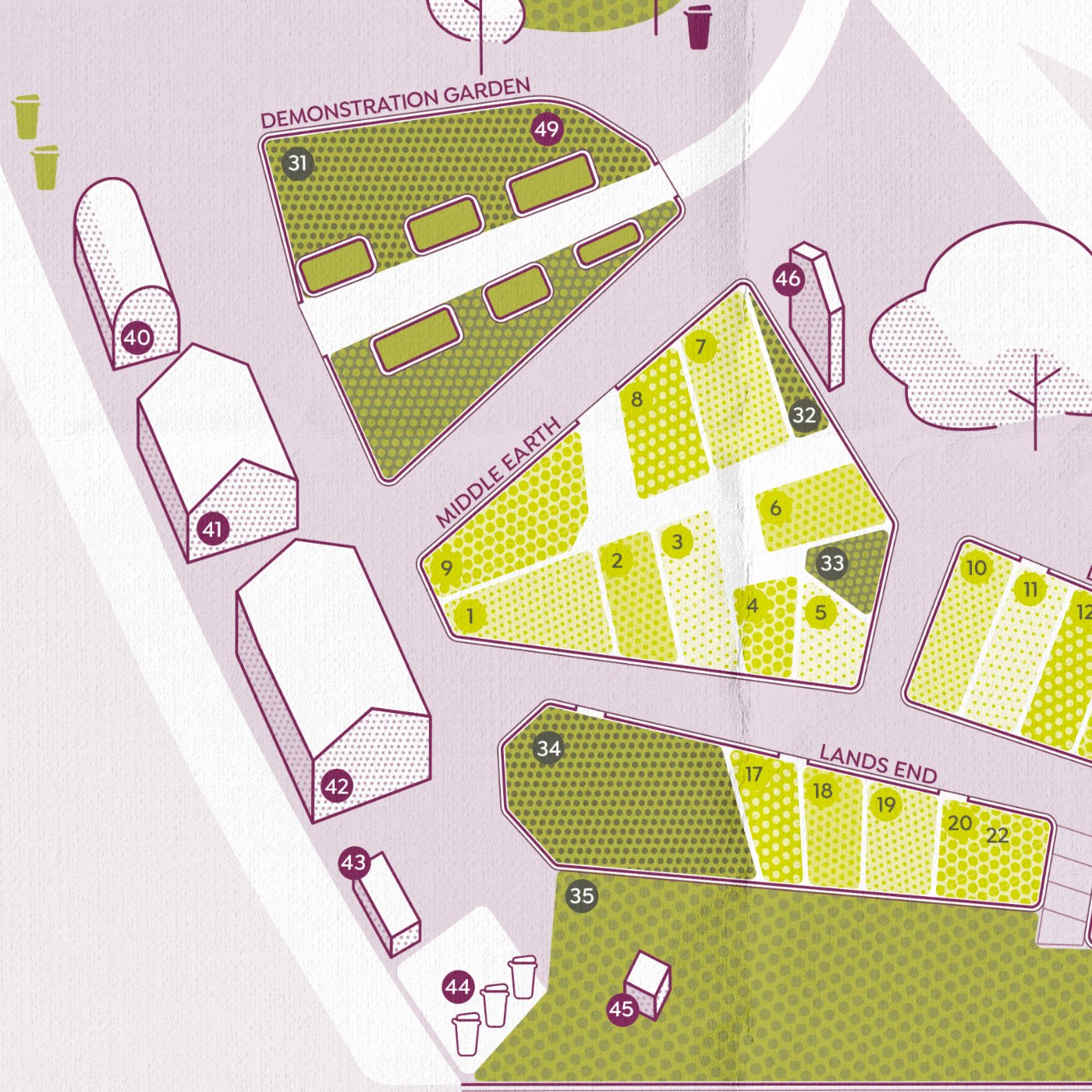
Distinctive dot patterns inspired by Aboriginal painting techniques used to in-fill designs or obscure sacred information.
Turramurra Lookout Community Garden in Sydney brings together like minded people of various ages and backgrounds to grow fresh organic produce, and learn about gardening and sustainable living. For their 10 year anniversary, TLC wanted to refresh their logo in order to better reflect the community’s identity and ethos.
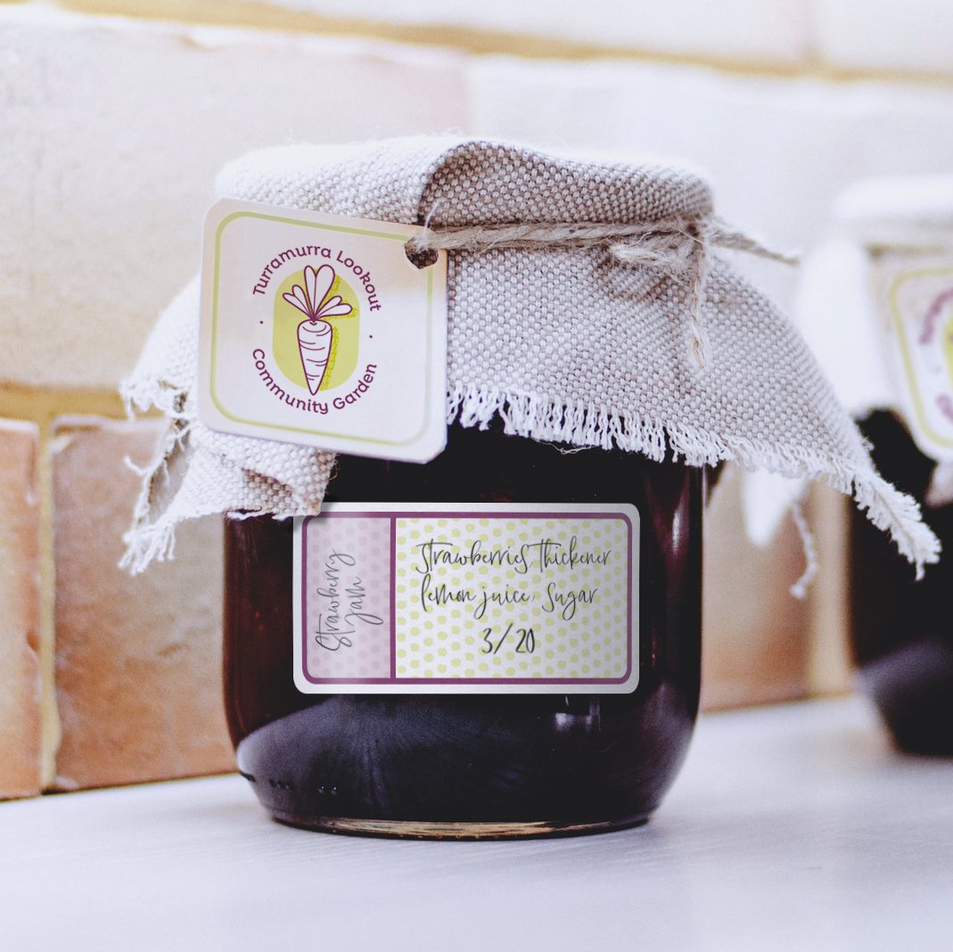
The garden members were fond of the carrot in their original logo, and thus it was preserved albeit within an updated color scheme that is fun, bright, and better suited to a wide range of applications across multiple scales.
The updated illustration style reflects the welcoming and friendly values of the garden. Organic and hand drawn lines paired with a quirky yet timeless font echo the garden’s strong DIY culture. We also designed a map to identify different functions, areas, and types of plots within the garden. Throughout the garden’s brand, but especially within the map, shapes are layered with distinctive dot patterns inspired by Aboriginal dot painting techniques that are used to in-fill designs or obscure sacred information from the public.
The garden sits in a suburb with an Aboriginal name, Turramurra; meaning big hill, where the original inhabitants were known as the Terramerregal. With the area’s Aboriginal past in its name, and consequently in the garden’s name, we were inspired to incorporate dot patterns within the garden’s identity.


